Madison Area and Wisconsin Covid Pandemic Dashboards
Honorable Mention, Digital Map Award in 48th CaGIS Map Competition
 Download Full-Size Image
I made this interactive dashboard of Madison Area (Dane County) showing COVID-19 Pandemic as well as
relevant information from a geographic perspective. This dashboard is originally
my volunteered product for community benefits, instead of seeking academic achievements, though I later
got endorsed by my research lab (SCDM) led by Professor Qunying Huang. One of
our research focuses is “spatial science for social good”, and we hope this product could be a practice
of “Wisconsin Idea”, that university research should be applied to solve
problems and improve the life of state citizens. Since all the data are available (from WI health
department), and we happen to have the skills and experience in bettering
visualizing these datasets, it is our duty and honor to serve our lovely local communities.
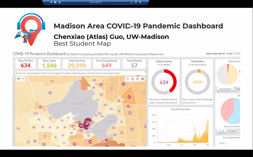 This map won the Best Student Map in
Wisconsin Land Information Association (WLIA) Map Contest
(2021), and is the Honorable Mention of David Woodward Digital Map Award in
48th
CaGIS Map Design Competition
(2021).
This map won the Best Student Map in
Wisconsin Land Information Association (WLIA) Map Contest
(2021), and is the Honorable Mention of David Woodward Digital Map Award in
48th
CaGIS Map Design Competition
(2021).
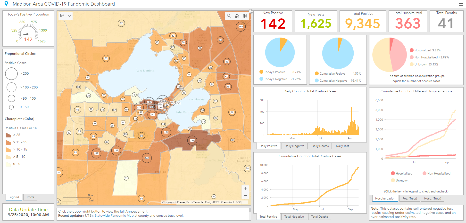
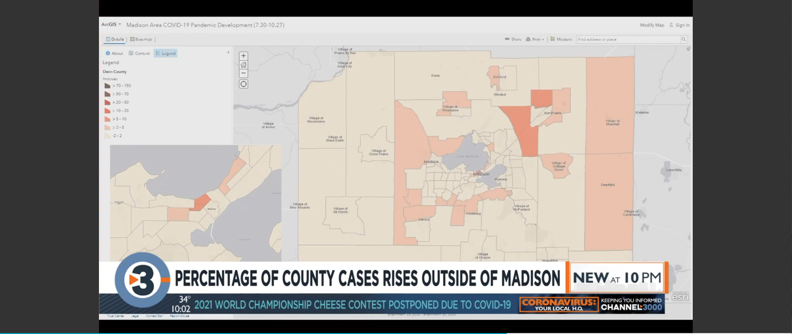
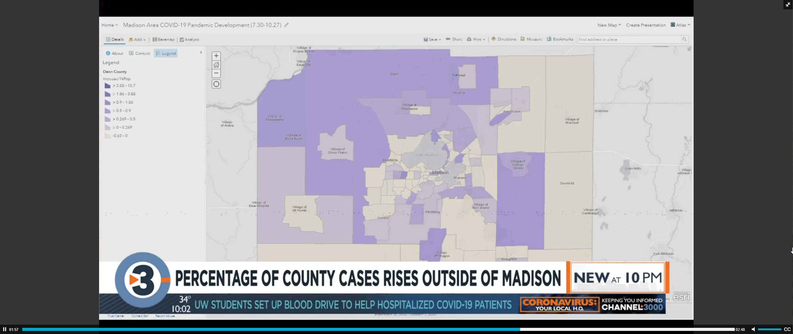
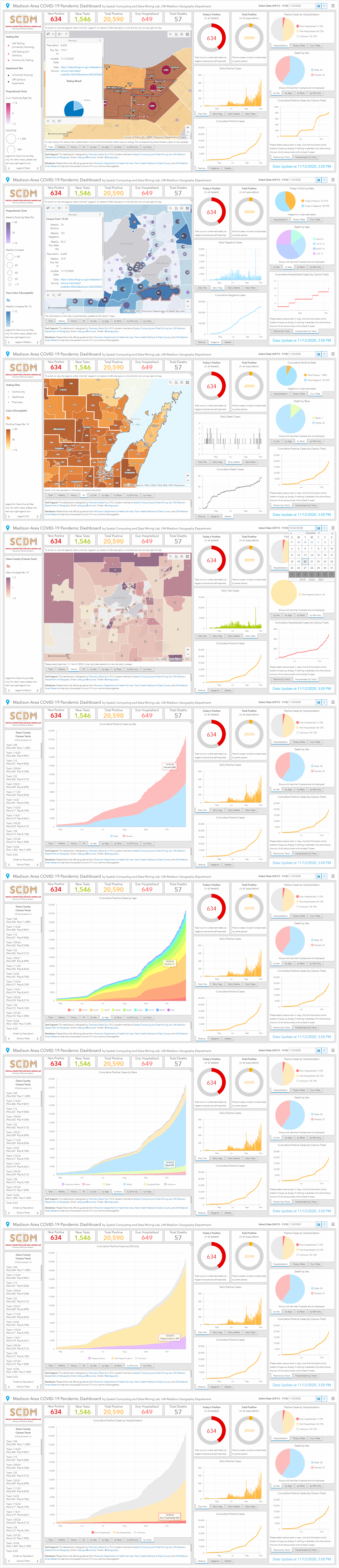
 Technically, I utilized Esri dashboard embedding ArcGIS Online interactive map to visualize the
cumulative and weekly pandemic and relevant infographics in Dane County (such as
university housing, major off-campus apartment, university and community testing sites). Most datasets
are from the server of Wisconsin Department of Health Services. The entire
platforms include desktop and mobile versions for Chinese and English interface, as well as a recently
released statewide version with similar visualization but more options of
administrative scale: census tract, zip code, sub-region (city, village, town), and school district.
Infographics include growth chart and deaths proportion by sex, age, race,
ethnicity, and hospitalization.
Technically, I utilized Esri dashboard embedding ArcGIS Online interactive map to visualize the
cumulative and weekly pandemic and relevant infographics in Dane County (such as
university housing, major off-campus apartment, university and community testing sites). Most datasets
are from the server of Wisconsin Department of Health Services. The entire
platforms include desktop and mobile versions for Chinese and English interface, as well as a recently
released statewide version with similar visualization but more options of
administrative scale: census tract, zip code, sub-region (city, village, town), and school district.
Infographics include growth chart and deaths proportion by sex, age, race,
ethnicity, and hospitalization.
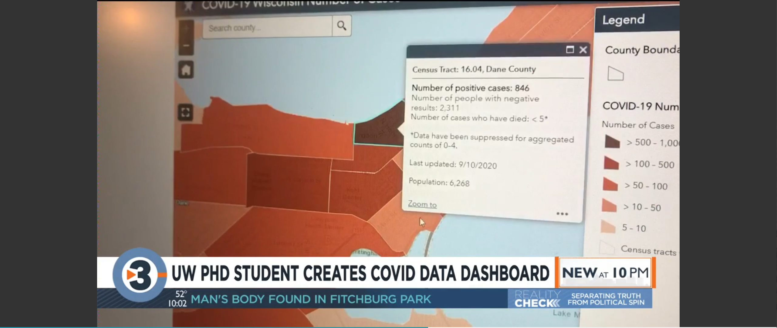
As a geography student, I think Wisconsinites should appreciate that our state government is willing to
provide these datasets in an organized and scientific way (accurate enough in
multiple levels, regular and frequent update, with historic data), together with satisfying
consideration of privacy issue (e.g. hide the number of positive cases when a tract has
less than 5 cases). As far as I know, over half of U.S. states only released county level data, and
Wisconsin is the state with best public Covid data availability. Our story in
Madison has already proved that even under similar overall patterns (Sep and Oct), the actual increase
modes could be significantly different: centralized outbreak in Sep,
distributed outbreak in Oct. Without data from a fine-enough geospatial scale, there is no way to make
targeted, effective, and scientific policies.
Though I have some different opinions on how the state health department utilizes choropleth map to
display total value, I don’t question their authority at all in leading us to
fight against the pandemic. In this tough time, staying together is so important, and we should
definitely show great respect and honor to WI Department of Health Service, Public
Health Madison and Dane County, and UW-Madison’s relevant department including “Smart Restart Plan”. I
hope my platform will become another useful tool in our toolkits, together with
the WI DHS website, PHMDC Dashboard and UW-Madison COVID Dashboard. People are supposed to follow the
official guidance and authorized information.
During an average day, there are about 500 daily visits from all platforms. The dashboard is
included/endorsed by
UW Data Science,
WLIA, and
Esri COVID-19 Map Gallery.
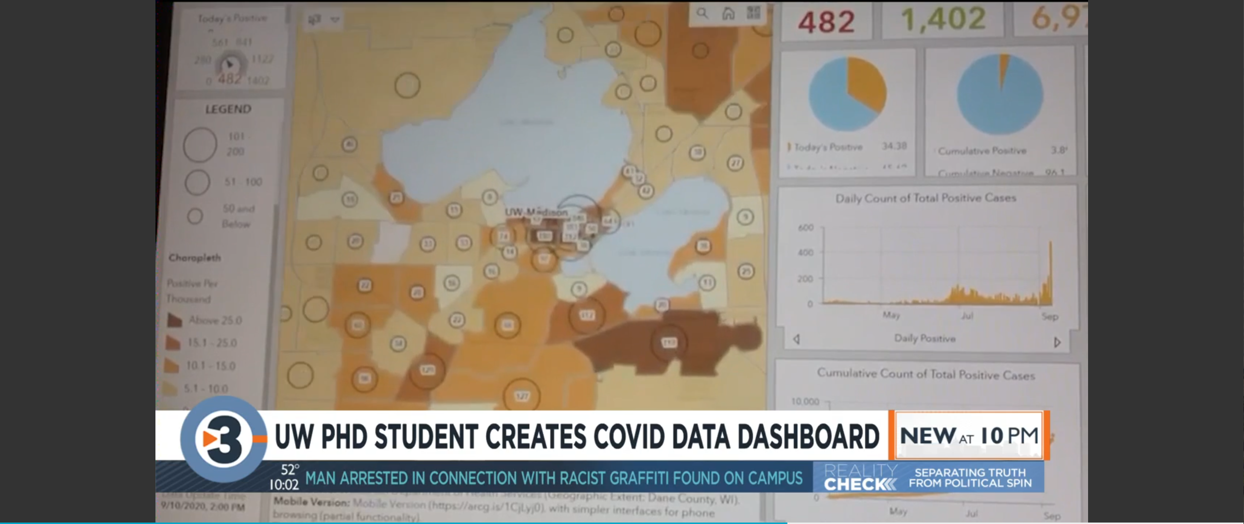
Relevant News Report: Oct 10, 2020 by Channel3000 (Article,
Video), reprint by News Break,
Ground News; Oct 27, 2020 by Channel3000 (Article,
Video), reprint by FOX47,
Badger Herald; Nov 9, 2020 by Badger Herald (Article), reprint by News Break.


 Download Full-Size Image