Mapping Twitter User Trajectories During COVID-19
Exploration with 5 million trajectories regarding COVID-19 using Kepler.gl tool
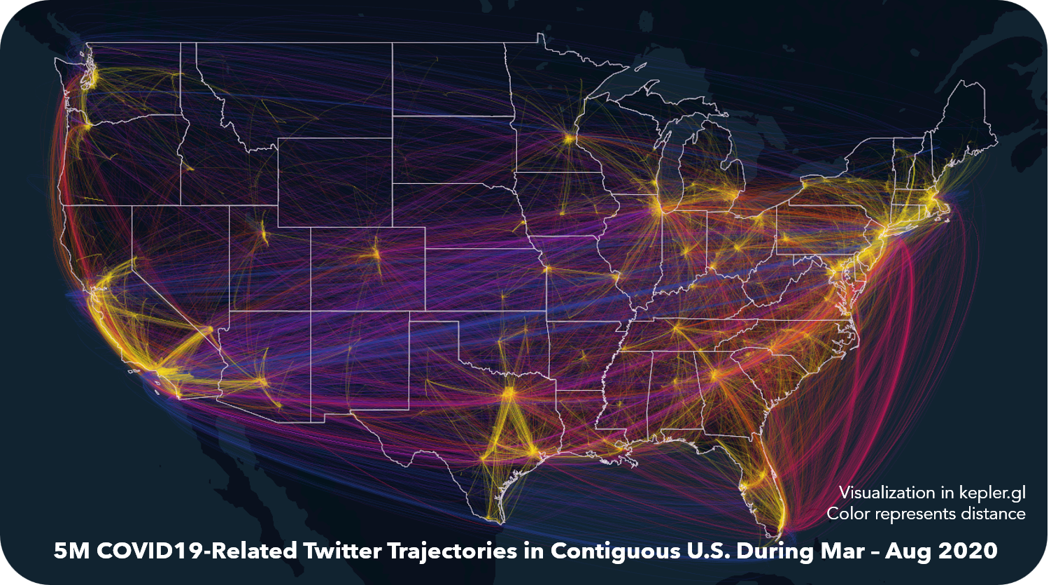 Download Full-Size Image
This is a by-product of presentation “Framing Twitter Trajectory Visualization: A Comparison Between
Hurricane Evacuation and Pandemic Lockdown” on IEEE VIS 2020 Workshop
MoVIS
(Information Visualization of Geospatial Networks, Flows and Movement).
http://move.geog.ucsb.edu/movis2020/ The research summarizes the general forms especially cartographic
representation for trajectory-based visual analytics, with discussions of relevant strengths and
limitations in visualizing social media data. A case study of geo-tagged Twitter data
is conducted with comparisons between evacuations during 2017 Atlantic hurricane season and lockdowns
during 2020 COVID-19 pandemics, illustrating how Twitter trajectory
visualization could benefit disaster management by revealing the spatiotemporal pattern of human
mobility. This image is made by Kepler.gl, directly visualizing the 5 million
Twitter-based trajectories regarding the COVID-19 pandemic. More following research results are coming soon.
Click
to watch the presentation on YouTube.
Below are static maps of the aggregated trajectories.
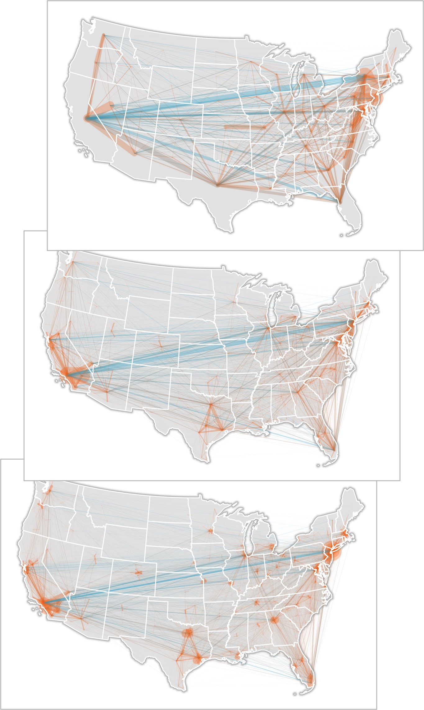 Download Full-Size Image