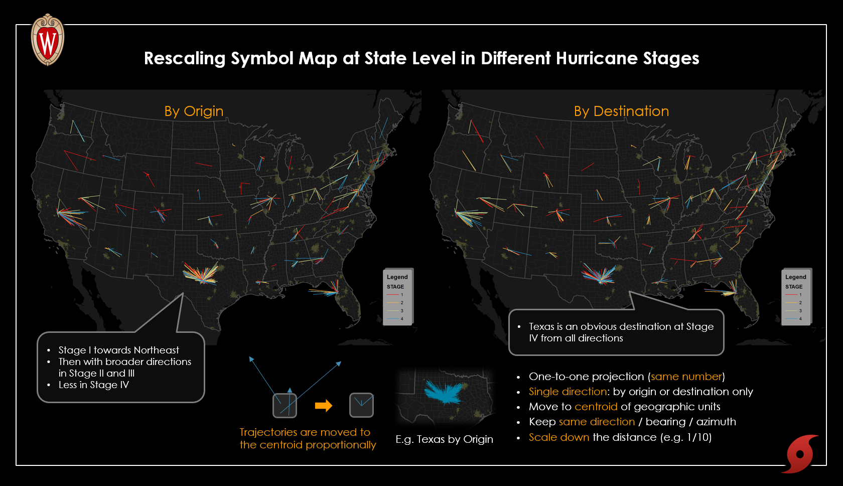
Rescaled Symbol Design for Trajectories
Innovative Twitter-based visualization of 2017 Hurricane Harvey
 Download Full-Size Image
This is an innovative map series I created for my research, in exploring the spatiotemporal pattern of
Twitter-based trajectories during 2017 Hurricane Harvey. Specifically, the
trajectories are moved to the centroids of aggregated units in proportion to their distance, according
to their origins or destinations. By keeping the same direction and same amount
but rescaling the distance, the overall pattern of each state’s trajectories is clearly displayed in one
map.
Click
to view the presentation abstract at AAG 2019.
The interactive version in Mapbox is available (by origin
and
by destination). An integrated
webpage of the Hurricane Harvey is also available
here, including an
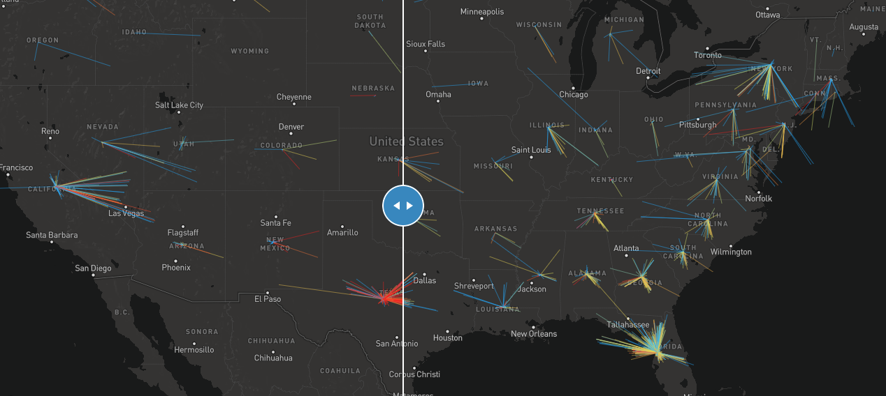
interactive comparison map
(below).
 View Full Image