Mapping Twitter Sentiments Towards Covid
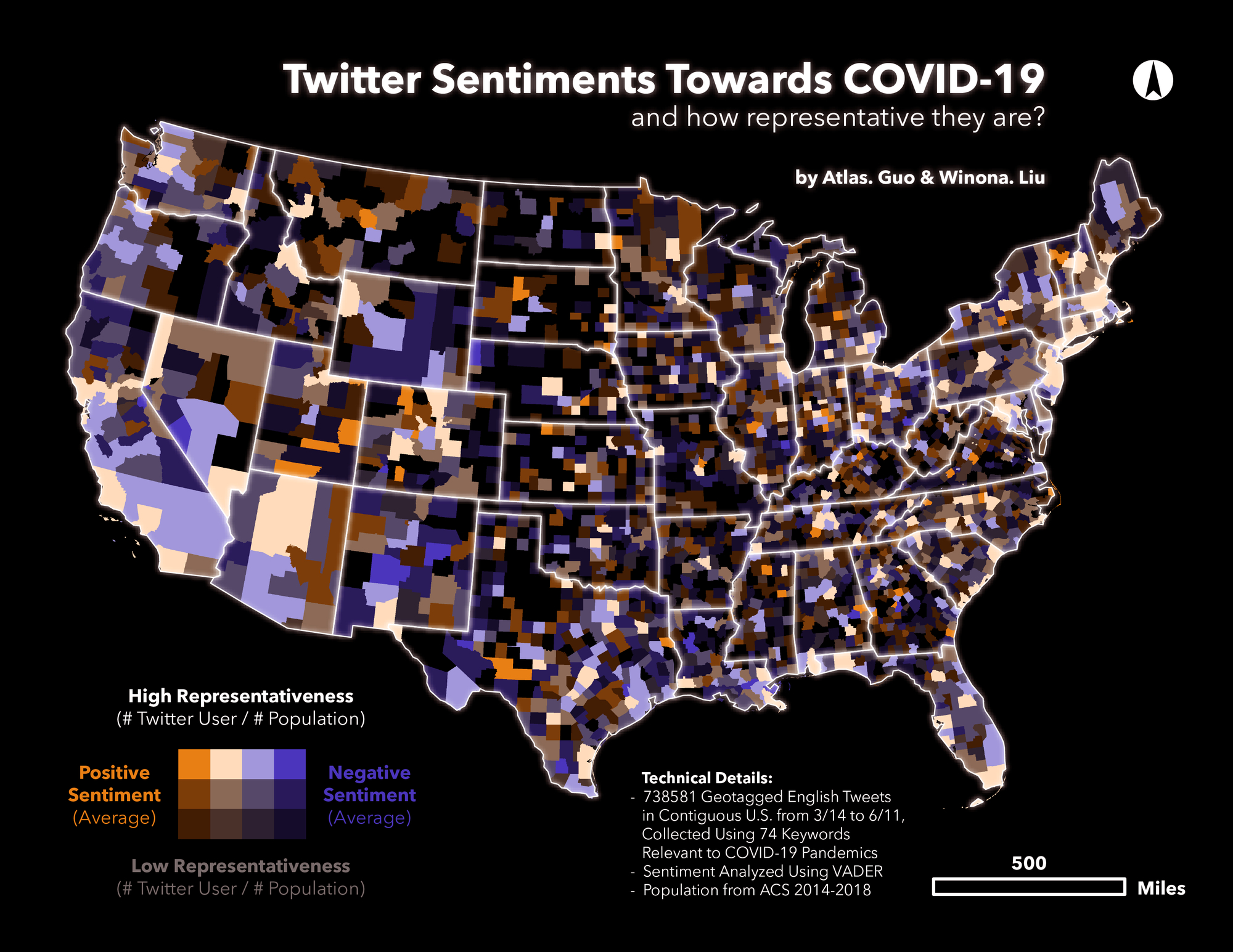
Value-by-alpha map of sentiments with twitter representativeness level
 Download Compressed Image
Download Full-Size Image
This bivariate map displays Twitter-based sentiments towards COVID-19 pandemic as well as their
representativeness level. The dataset is based on 738,581 geo-tagged English Tweets in
contiguous U.S. from March 14 to June 11, collected using 74 keywords relevant to COVID-19 pandemics.
The sentiments of tweet content are generated using VADER package. At county
level, the average sentiment of individual tweet user is calculated in a positive-negative scale, while
the representativeness level is denoted by the proportion of twitter user in
total population (from American Community Survey 2014-2018). Inspired by the Value-by-Alpha map (Roth et
al., 2010), we use the alpha / brightness value to illustrate the
representativeness level, based on which the red color displays the positive sentiment, and the blue
displays negative.
Click
to learn more about value-by-alpha map.