Climate Visualized
An exploratory web map of Köppen-Geiger climate classification
Winner of David
Woodward Digital Map Award, 53rd Annual CaGIS Map Design Competition
Runner-Up of Interactive Map,
Wisconsin Land Information Association 2026 Map Contest
 View the
Interactive Map
View the
Interactive Map
(If you are looking for the static poster version of this map, here it is: Köppen Climate Visualized)
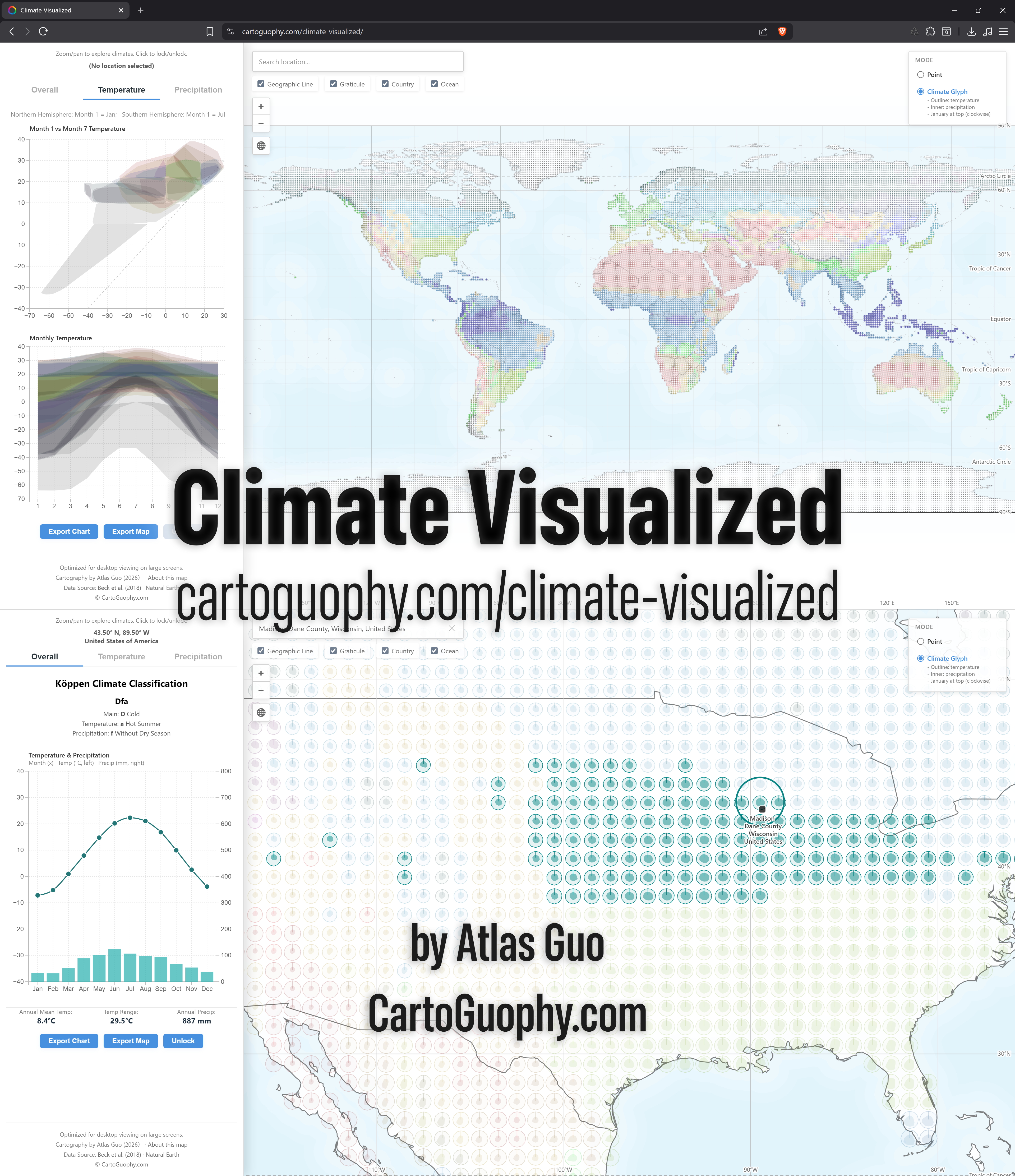
I have long been interested in climate, especially climate diversity and climate change. As I explored more climate-related topics, I realized that attempts to visualize climatic characteristics are surprisingly scarce. During my high school and undergraduate geography education in China, I was more familiar with a climate classification system tailored to China's climatic characteristics, rather than the internationally dominant Köppen-Geiger climate classification. For this reason, I decided to begin with the Köppen system and create a multi-dimensional infographic of its monthly temperature and precipitation patterns. These visualizations are intended both as reference material for scholars in related fields and as an engaging tool for public geographic education and exploration.
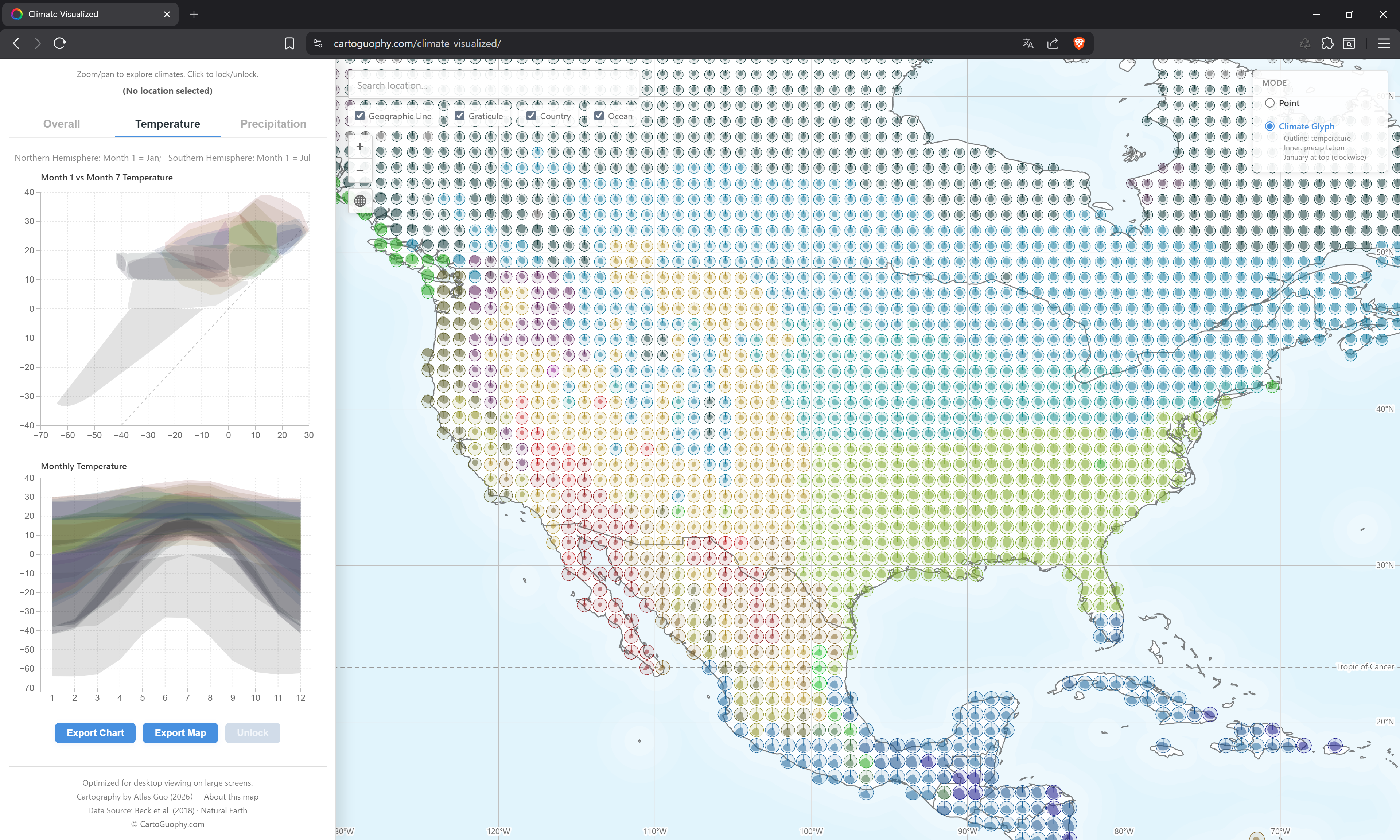
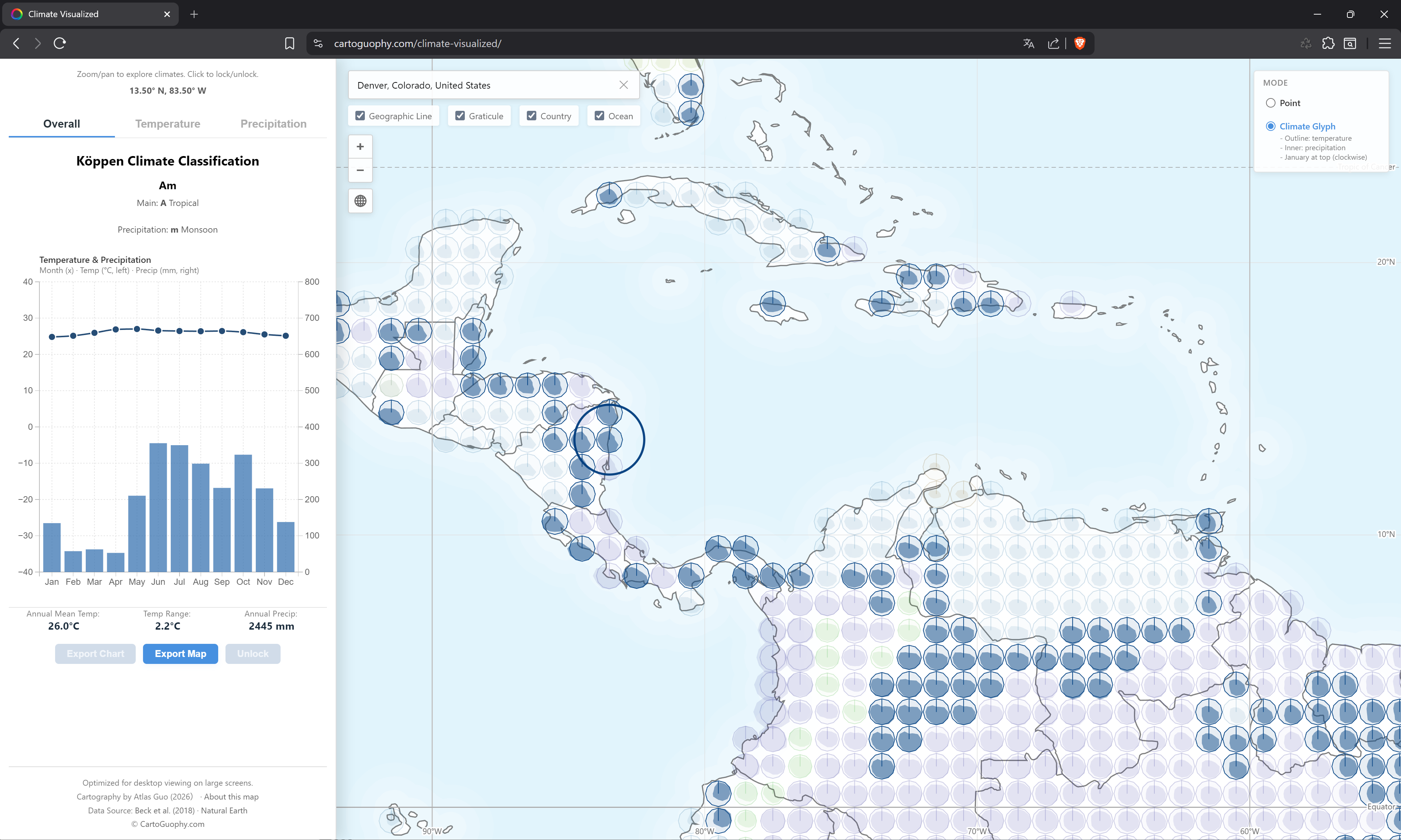
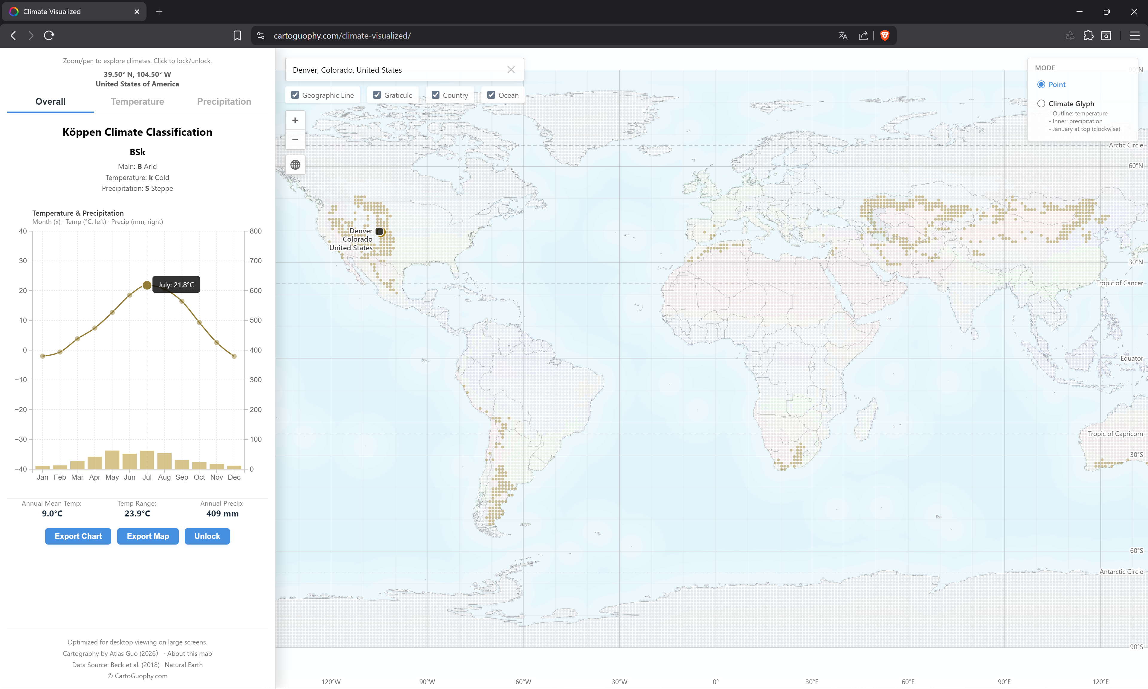
I firstly reviewed recent advances in the Köppen climate classification and its cartographic representation. Setting aside the highly varied color schemes in popular science atlases, there are broadly two mainstream approaches: those represented by Kottek 2006 and Peel 2007, and those proposed by Beck 2018 and several subsequent studies. In my humble opinion, each approach has its own strengths and weaknesses in terms of color design. However, considering the latter's advantages in public communication and data openness, I chose to adopt their classification standard, color scheme, and most importantly their dataset. I currently utilize their lowest resolution version (a spatial unit of one degree latitude by one degree longitude) for the period 1990 to 2020. At this resolution, the original 30 climate types are reduced to 29, and all of my visualizations are based on this dataset.
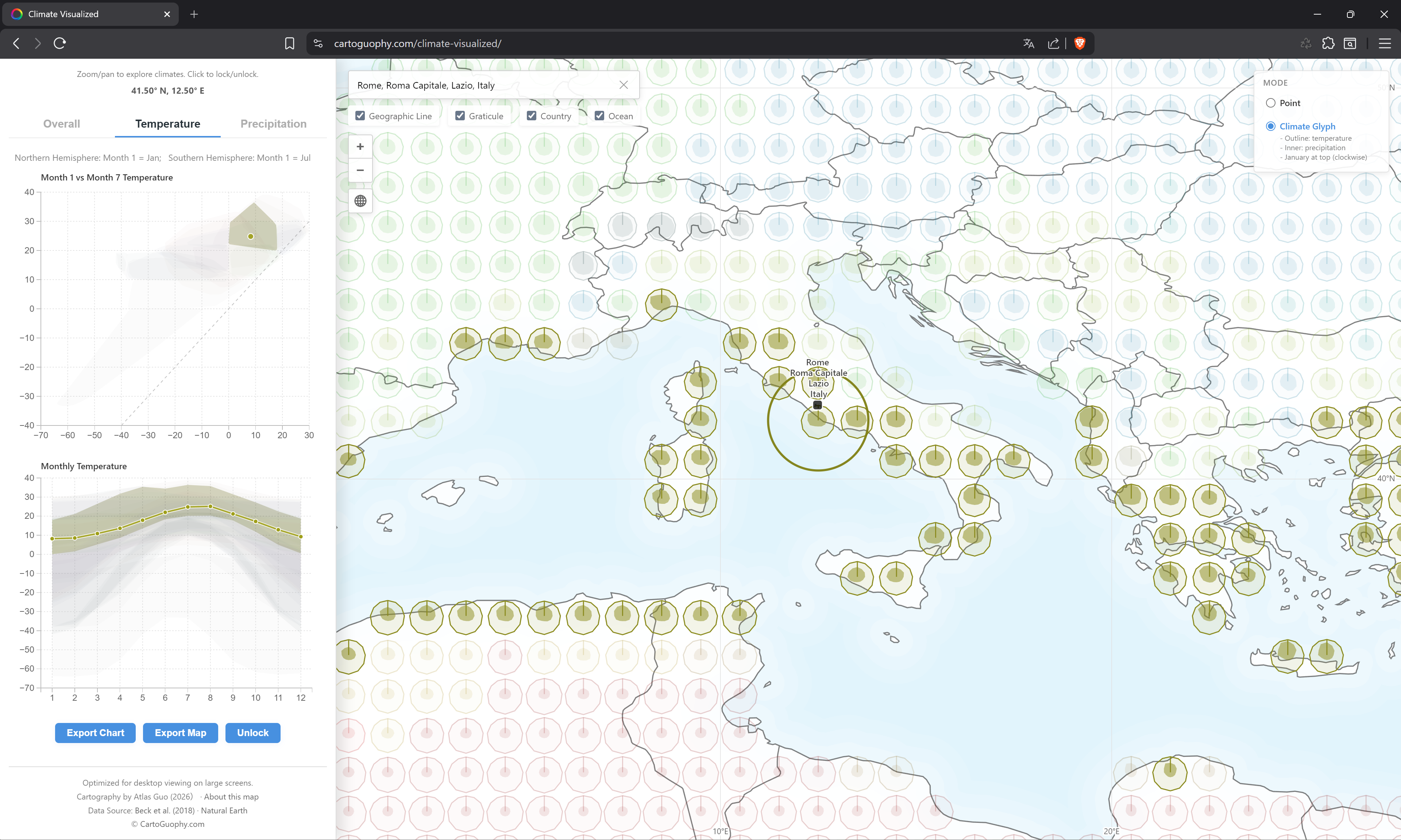
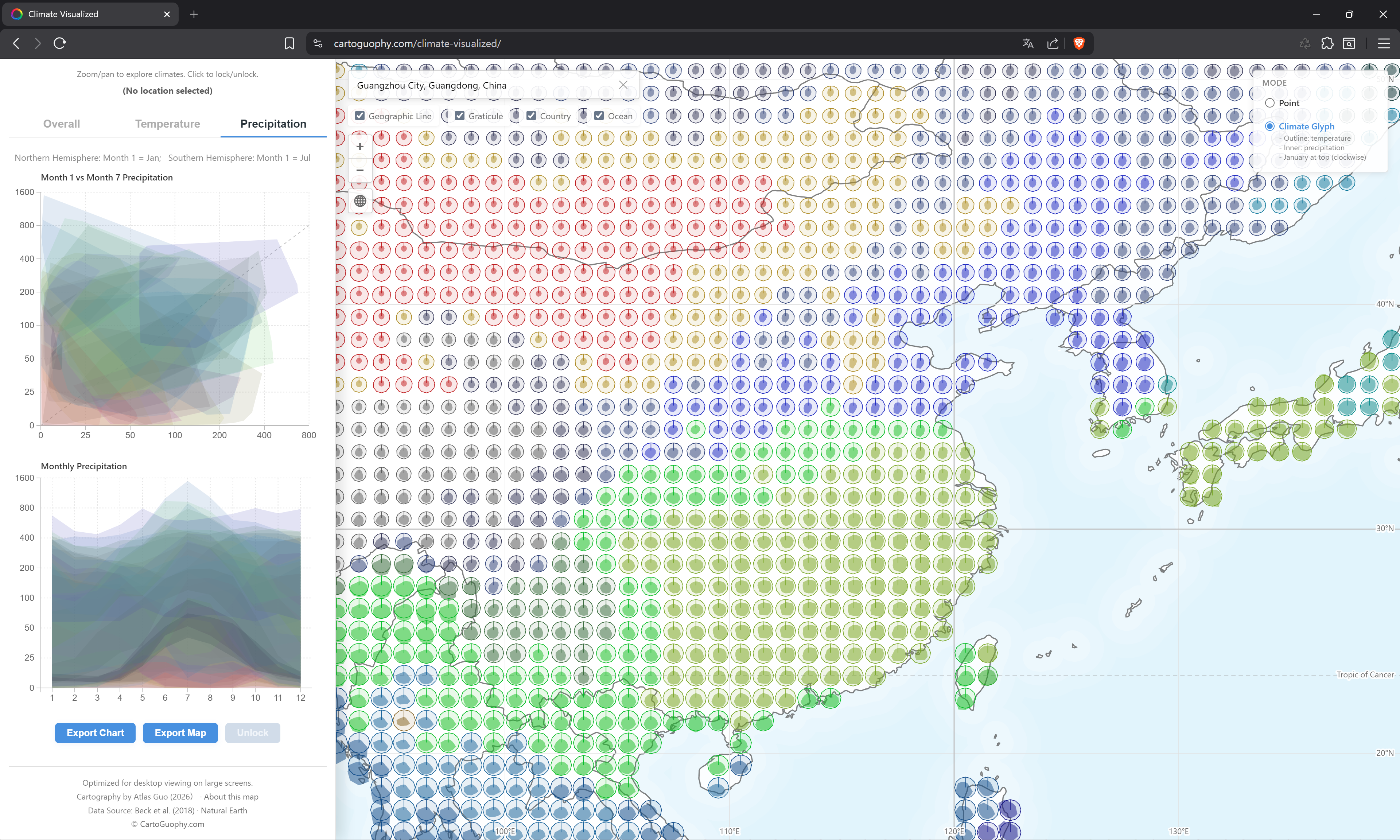
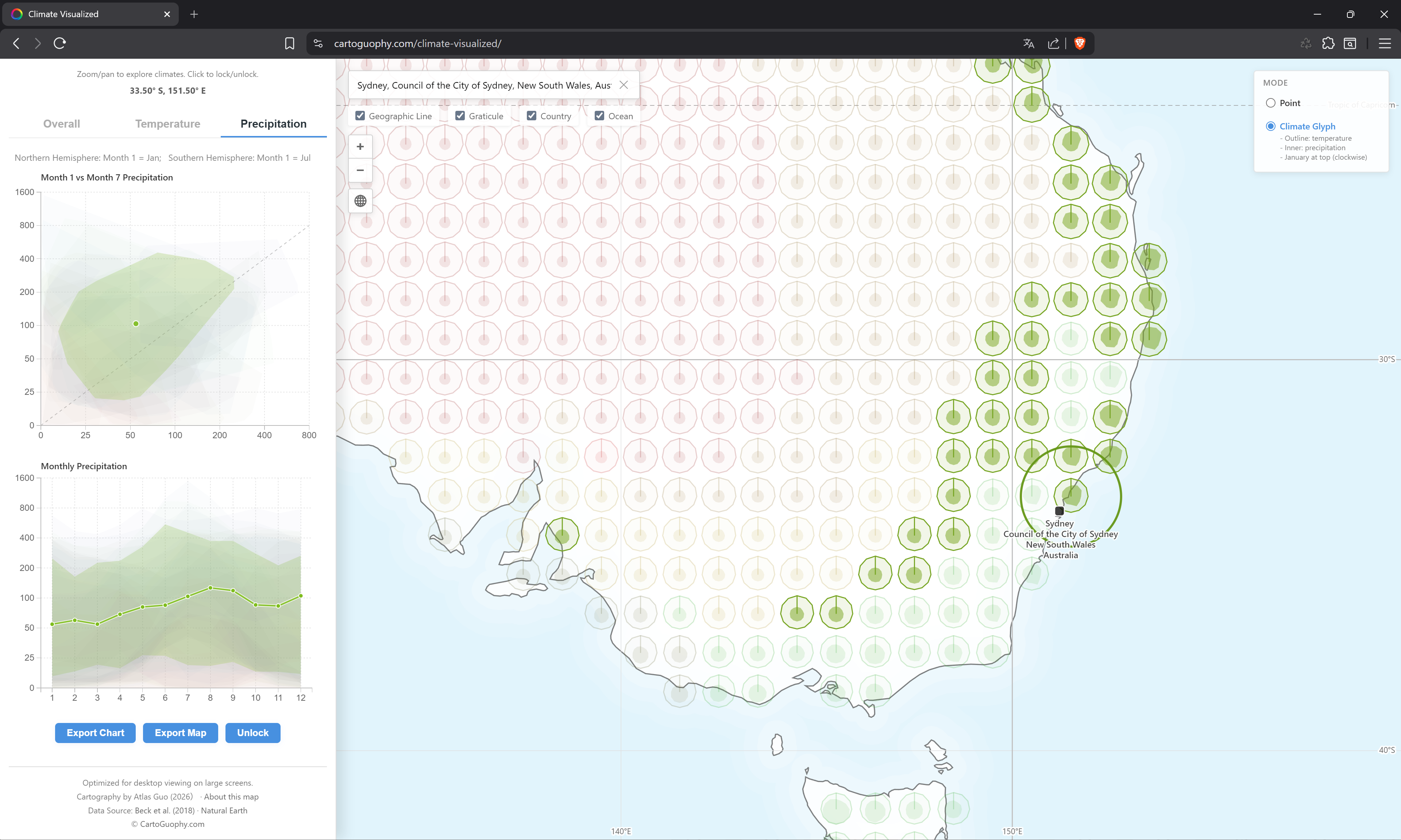
The main part of this web map depicts monthly temperature and precipitation at each grid point as a statistical chart, arranged clockwise starting with January at the top. January's temperature node is connected to the center of the chart, making the month pattern more apparent. In terms of color, the colors used in the Beck paper (2018) were adjusted through a consistent set of rules to achieve a clearer and more aesthetically pleasing result.
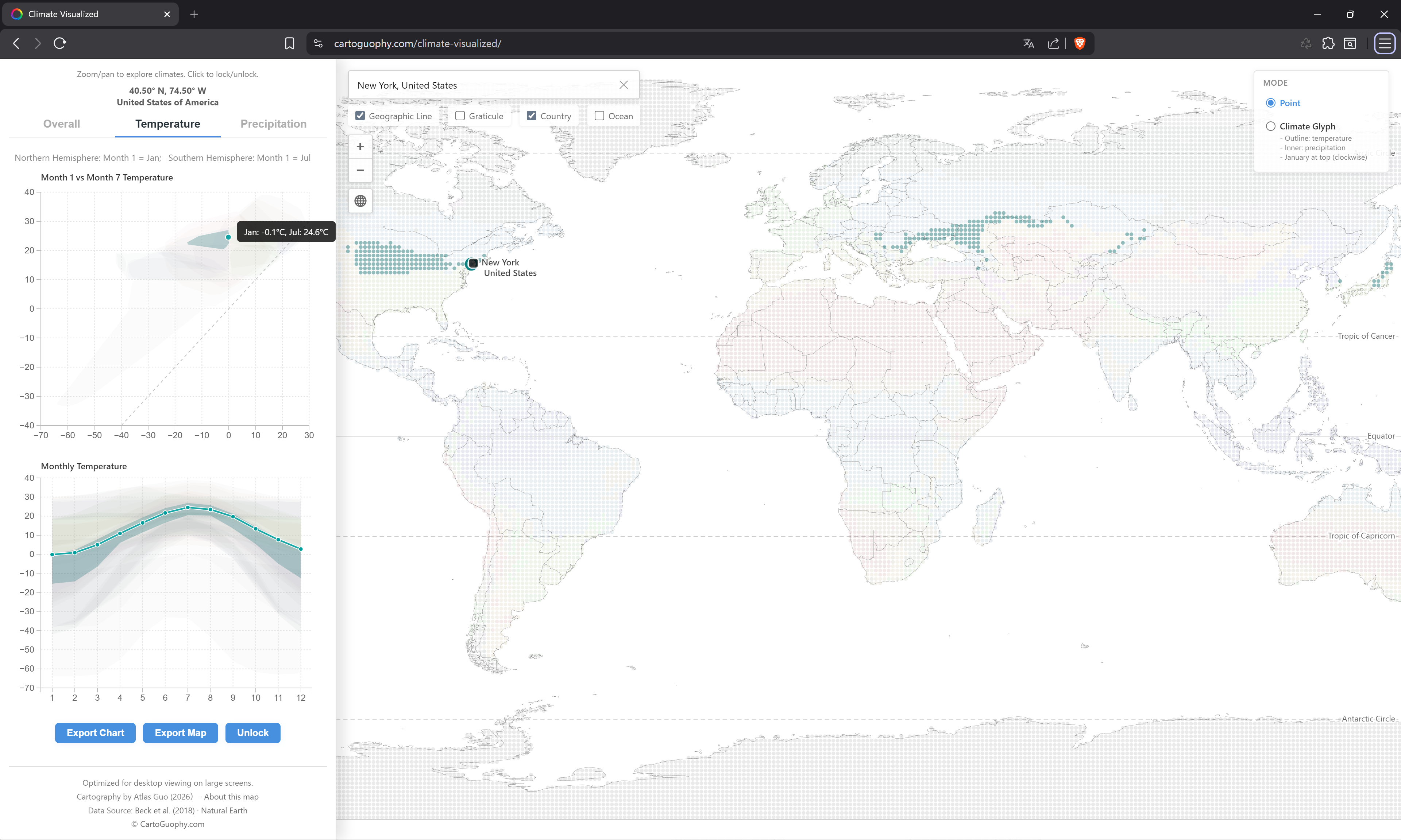
When the mouse hovers over any valid location on the web map, the corresponding Köppen climate type, the meanings of its associated letters, and statistical charts representing the local annual temperature and precipitation are displayed in real time in the left panel. This allows users to intuitively understand the climatic characteristics of different places globally. More features showing temporal pattern of temperatures and precipitations are added into the second and third tabs in the left panel. It also allows users to export images of the charts and maps of current extent.
Built with D3, this map can serve as a reference and exploratory tool for geography students of all ages when learning the Köppen climate classification and exploring global climate patterns.
(Major Data Source: Beck, H., Zimmermann, N., McVicar, T. et al. Present and future Köppen-Geiger climate classification maps at 1-km resolution. Sci Data 5, 180214 (2018). https://doi.org/10.1038/sdata.2018.214)
This map is the winner of David Woodward Digital Map Award in 53rd Annual CaGIS Map Design Competition.
This map is the Runner-Up of Interactive Map Category in Wisconsin Land Information Association (WLIA) 2026 Map Contest.