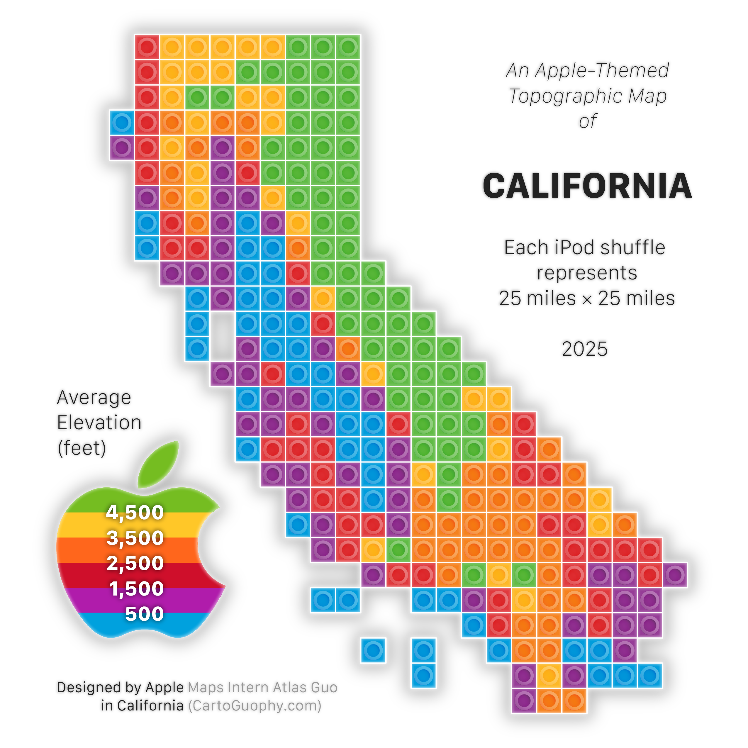
Apple-Themed Topographic Map of California
Featuring rainbow Apple logo and iPod shuffle music player as a creative salute to Apple
 Download Full-Size Image
I designed this Apple-themed California map as a creative salute to Apple, based on another
California LEGO map
with classic topographic color scheme.
If you are familiar with the history of Apple Company, you might immediately recognize the classic
colorful apple logo (1977-1999), which is now used as the graphic color ramp for
elevation. Considering the limitation of this abnormal color scheme for topography, I adjusted the
classification scheme to have equal intervals to make this design more
understandable.
In terms of the LEGO unit of square brick/plate with a round circle, I designed this to be less alike a
LEGO element, but more like iPod Shuffle, the classic Apple music player
(which I love and still use today).
Click to view this LEGO Apple Maps Icon, and more of my LEGO-Style maps!
This map was displayed in the map gallery (postcard / tiny map) of North American Cartographic Information Society (NACIS) 2025 annual meeting at Louisiville, KY (Oct 15-17). Check out my other entries in the map gallery!